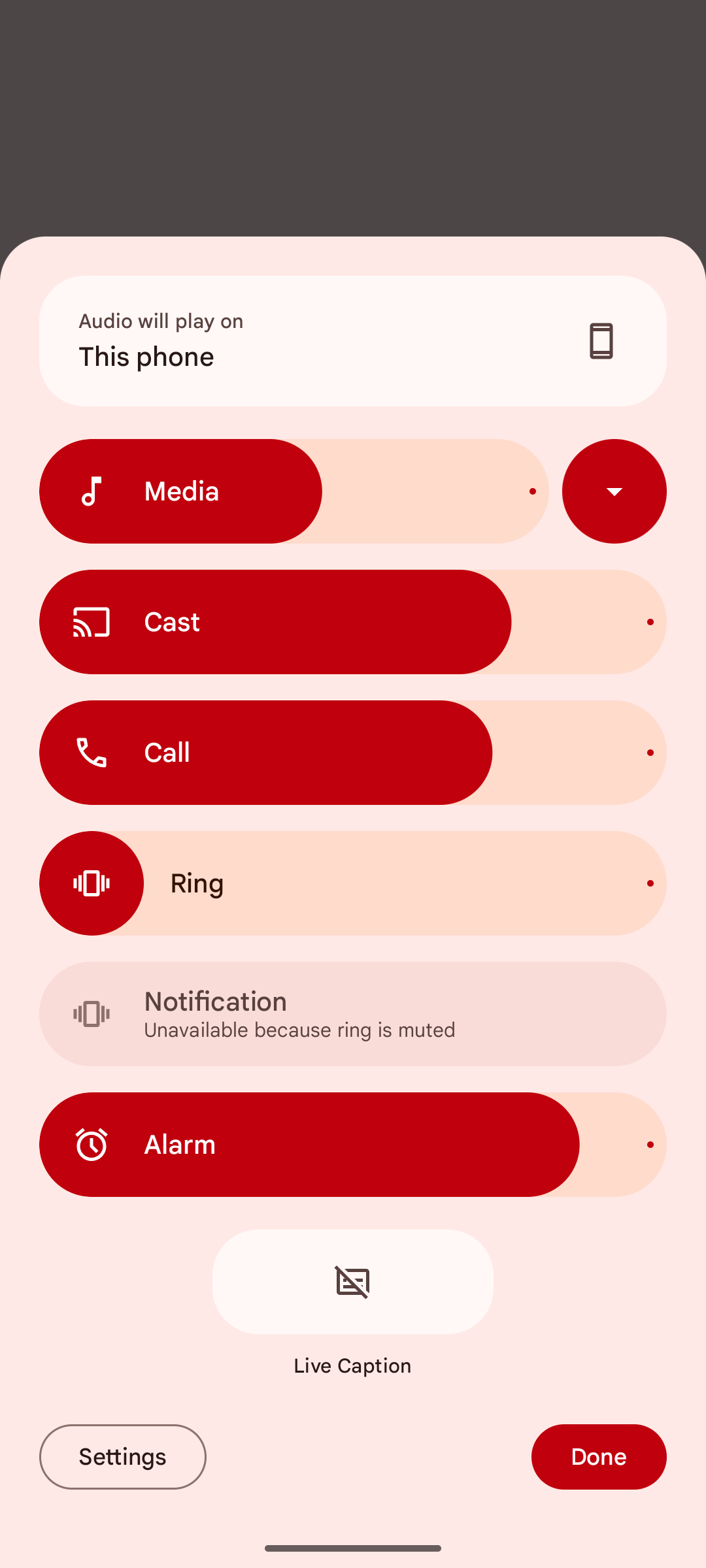
Google has redesigned the volume menu in Android 15 Beta 2 with new features and a more attractive look.
Changes to the Volume Menu
It's important to note that these changes don't apply to the volume slider that appears when you press the physical volume buttons, but rather to the more comprehensive volume menu that pops up when you tap the overflow button. This overflow menu was first introduced by Google in Android 10 and its design hasn't changed much since then.
Cheerful Material You Design
The new design, which comes by default in Android 15 Beta 2, embraces the Material You concept. The volume sliders are now larger and more colorful, but their overall functionality remains the same.
Useful New Features
In addition to the new look, there are a few new features that have been added. At the bottom of the menu is a shortcut for Live Caption, as well as an audio output switcher. Previously, audio output settings in Android could only be accessed through the media widget in Quick Settings. Now, you have another easier way to change it. Additionally, a volume slider for Cast will also appear when necessary.
More Flexible Menu
There's a button next to the "Media" slider that allows you to collapse the menu. Best of all, the menu will remember your last setting and display it automatically the next time you open the volume menu.
Unexpected Appearance
This new design actually surfaced back in April, but there was no word on when Google would officially release it. Since then, Google has added the shortcut for Live Caption as mentioned earlier.
Overall, the new volume menu in Android 15 Beta 2 is a welcome change that makes it more visually appealing and easier to use. The new features are also a nice addition, especially the audio output switcher and the ability to collapse the menu.
I hope this helps! Let me know if you have any other questions.


0 comments:
Post a Comment