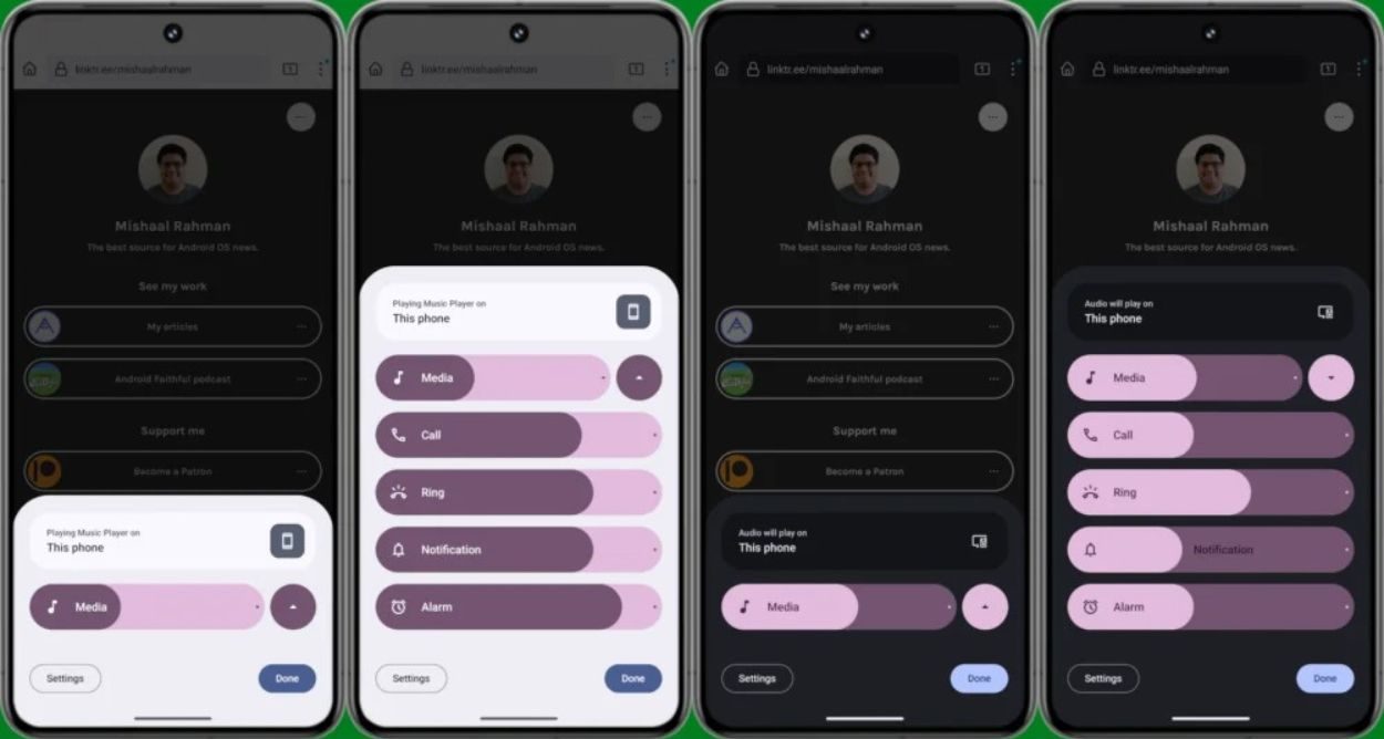
Google's Android 15 developer previews have mostly focused on internal changes, but hints suggest significant user-facing features are on the horizon. One anticipated change is a potential revamp of the volume panel, offering a glimpse into what's to come for Android 15.
Despite numerous UI/UX updates since Android 12, the volume control panel has retained its old sliders, lacking the Material You-styled design seen in other components. Activating with a press of the volume rocker and a tap on the three dots, the panel has remained relatively unchanged—until now.
Mishaal Rahman, via Android Authority, uncovered a manual activation of the new Volume Control panel within the latest Android 15 Developer Preview. Notable changes include thicker volume sliders and a relocated option to change the output device, now prominently visible at the top of the panel.
The revamped panel features tappable slider icons, allowing users to quickly mute or unmute streams. Additionally, it collapses with a tap on the arrow beside the "Media" volume stream, providing a more streamlined user experience.
Unlike before, the media output is consistently displayed, regardless of active media playback. When idle, it showcases the media playback source, dynamically updating when media is playing.
While the design is still in flux, future iterations may include features like noise control and spatial audio. Expect Google to introduce this feature in the upcoming Android 15 Beta, anticipated for release in April.
The outdated appearance of the volume sliders, reminiscent of Android Pie, contrasts with the modern Material UI elements introduced with Material You. Nevertheless, the attention to the volume panel's design and the addition of playful animations demonstrate Google's commitment to enhancing the user experience.


0 comments:
Post a Comment